Monday, 29 November 2010

CD Cover Comparison

Out of the three that I analysed, I decided that the KJ52 and Aesop Rock covers would be most relevant to me and decided to compare them. Both have colours (obviously) but use them very differently, where the Aesop Rock cover has a fairly limited palette, the KJ52 one seems almost random with the colours chosen, giving it a much more lively feeling than other. They also have a different feeling, the Aesop Rock's cover's cartoon makes it seem considerably more mature than the guy sitting on the television and indicates the difference in age of the target audience, leading me to believe that the Aesop Rock one is aimed at an even older audience. I feel that this is reflected in the music, as Aesop Rock's music does tend to have a much more serious tone than KJ52.

I still stand by my decision that the KJ52 iconography isn't as strong as the iconography for the Aesop Rock cover. Although the genre itself is easy to tell, within it's genre it's not very unique at all, where as there aren't that many bands with a similar iconography to Aesop Rock's. The KJ52 iconography could easily be copied and made just dissimilar enough to avoid lawsuits, like Tetris and not being able to call a falling blocks game anything ending in 'tris'.

I've learned that the iconography itself can be easily tweaked or meddled with to make two completely different looking covers that still fall within the same genre iconography. I've also learned that the late teens to very early twenties are quite the varied bunch. Many of the covers aimed at them that I've seen are completely unlike another of the genre.
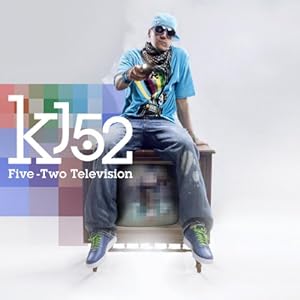
Five Two Television
The KJ52 Five-Two cover features the lead in the group of the band, suggesting that he is the main focus of the music. From this and the way he's dressed I'd say that this was a pop group or RnB. The colours used within the picture also suggest this because they're all pretty bright like pop music albums usually are. Subsequently, I'd say that the target audience were teenagers. due to the clothing style and the colours used, bright colours usually appeal to younger audiences, but by dulling them down slightly (in this case making them lighter) lifts the target audience's age range from children to teens. I think it's not a very strong iconography itself, but it could be easily translated to other media, i.e. using light colours on a website or the artist wearing the same style of clothes in the video.

Bazooka Tooth
The Aesop rock cover for Bazooka Tooth features a cartoon of a boy, rather than images of the band, implying the the band is indie or alternative. The colours used are also mostly yellows, browns and greens, again a common colour scheme for indie music. From this and the more mature style of the cartoon, I'd say that the target audience were people in their late teens to mid twenties. The fact that they seem to be in school uniform doesn't change my opinions on the matter, due to the colours and style. I think it's successful at creating a brand identity
purely because of it's cartoonish style, in a similar way to the Gorillaz are famous for their cartoon alter egos and I can quite easily see them having an animated video and patterns like the wallpaper in the background.

Tchaikovsky: The Collectors Edition
The cover for the Tchaikovsky Collectors edition, performed by the London Philharmonic Orchestra features a photo of Tchaikovsky as the main focus, and the addition of decorative floral patterning indicates that this is a classical album. The mentions of symphonies and orchestras also helps to make this completely clear (though the Trans Siberian Orchestra's probably not the best example for mentioning orchestra related names connoting classical music.) From this I would say that the target audience is probably gender neutral, due to the mention of Romeo and Juliet, and aimed at people around 28-36 because of the grey colour scheme. I'd also say that it was people fond of Tchaikovsky's works, due to the large picture of him on the cover. I think that this could potentially be a fairly strong iconography, though it could have been stronger had it been related more to St Petersburg. But as It's probably for people that know the artist, they would probably know that he's Russian.

Wednesday, 24 November 2010

Narrative Filming Done

Awwyis. We've finished filming the narrative part of our film. It looks pretty awesome so far, but the doors here don't know how to close themselves. They kept opening when they were like, less than an inch open. Bleh. But apart from that, all went well. Though we might not have enough for the whole song, we can just film a quick performance if we need more meat on the bones. To make a clear iconographical link we could have the group members wearing the mask and can then put images from the video into our CD covers and website.

Thursday, 18 November 2010

Brand Identity

How have you used web page conventions to create brand identity?

I have used the conventions of a webpage to create brand identity

Layout/navigation/video
Specific aspects of the convention (what have you produced, how did you you do it?)
How the use of the convention reinforces the use of the convention reinforces the recording artist's iconography and brandidentity

Haha Awesome.

We started our filming yesterday. I think it went pretty well, we got quite a few shots of the large group of children marching and in the classroom, but I'm not entirely sure we're gonna have enough footage. We might have to improvise performance or something. Hopefully not though.

Thursday, 11 November 2010

Shooting Schedule

If we don't have the masks by Wednesday:
-Shoot the CCTV shots of the building. This will be needed to do without any person in shot.
If we do have the masks be Wednesday:
-We do all the marching shots with the kids, all shots where they are moving in main street e.g. the shoes, the rebel looking
round the queue etc. We will have to do these shots during lesson time so no disturbance will occur.
-Shoot the classroom shots where all the students are working then the rebel runs out. This will involve the whole cast as well as
the marching will. This will require an empty classroom which won't be interfered with during shooting.
-We will then do the escape scene which will also involve the whole cast including teachers. This will require some outside work
therefore the weather will need to be right - sunny, not wet.
-Then we will do the toilet scene with the rebel boy. This will not take long but is an important part of the video.
-We then will shoot important shots such as the CCTV or certain shots of the teachers e.g. one walking on the bridge.

This shooting schedule can be spread out over two days but the same cast would be preferred in order of them knowing what they were doing and how to act the part etc. If this isn's possible then it isn't a major problem as most of the cast are wearing masks so no one will know we haven't used the same people. The rebel will have to be the same as his identity is shown and to keep with continuity he has to stay the same.

Wednesday, 10 November 2010

Masks

For our film we needed to include masks to make the group of kids all look the same. Originally we had planned to use plain white masks. But when we saw the the comedy and tragedy masks like the old theatre ones. We're going to get 29 happy masks and one sad one for the rebelling child to wear. We had also considered using the editing software to blur their faces, but this would have been far too difficult to do due to the limitations of our software and it would have taken more time than we have to edit each and every one of the faces in each of the frames.

We also plan to use chroma key to make the gold of the mask stand out in the shot to draw attention to him since he's the main focus of most of the video.

Monday, 8 November 2010

How have you used web page conventions to create brand identity?

I used a combination of Gimp and Photoshop to create my banner, the latter of the two ing the preferred software, even though I only actually used it for the font effects. For the background of my banner I used a photo of Hollywood to relate to the name of the group, setting it to multiply so that it would pick up the grungier looking texture and greyish blue colours of the layer below. I then used these colours as my website colour scheme, bringing out the blue on one of the buildings into the back of my menu bar to make it stand out more. Though I had originally been going for more green colours, I decided that the bluey grey would look better. I've also only used red once in the logo to draw the audience's eyes to it, just to make sure they'd see it. I also used a different font for the name of the single to be released in the corner, again to draw the audience's eyes too it, since I want them to buy said single. I tried to keep it relevant to the lyrics and topic of the song rather than the band itself, but used colours from the rest of the site so that it would still fit in.

For the main body of the text I used arial, everyone's default font just to make sure that people could read it. I would have used the type writer is font as well, but I thought it'd be best if they could actually read it as if they can't read it, I can't convince them to like the band and spend their money on them.

Wednesday, 3 November 2010

In lesson we discussed our ideas for our music video. We decided to do it about the fairly oppressive way we tend to view the school system. We're planning to make them seem like prisoners with in this system, using teachers like a sort of dictator figures and riot police. To give this narrative we're going to have one nonconforming student that's 'breaking the mould' and later encourages the other students to rebel along side him.

addmorelater

Monday, 1 November 2010

Homepage Production

Logo:
When I made the logo for my group I used contrasting fonts. I decided that it would be best if I used the name of the group, "Hollywood Undead". I kept the 'Hollywood' part of the logo similar to the letters on Hollywood Hill as it would be a clear visual link to the band's name and would help people to remember the name, since people make links between images, sound and words and this will help them to effectively remember the name of the group.
I used a darker, more destroyed looking font to fit in better with the conventions of most rock/metal groups. It's bold and attention drawing, more so than the hollywood part. This is intentional because the Hollywood by itself may indicate a pop group or something like that, which is obviously not what I wanted.
I also included blood splatters which fit into the conventions of a metal band since quite a few of them seem to have organs, bones and blood (and sometimes worse).